Client: Mamada Mints
Project: Brand Identity & Packaging Design
Scope: Branding, Visual System, Copywriting, Packaging Design
Role: Brand and Packaging Designer
Project: Brand Identity & Packaging Design
Scope: Branding, Visual System, Copywriting, Packaging Design
Role: Brand and Packaging Designer
The Challenge
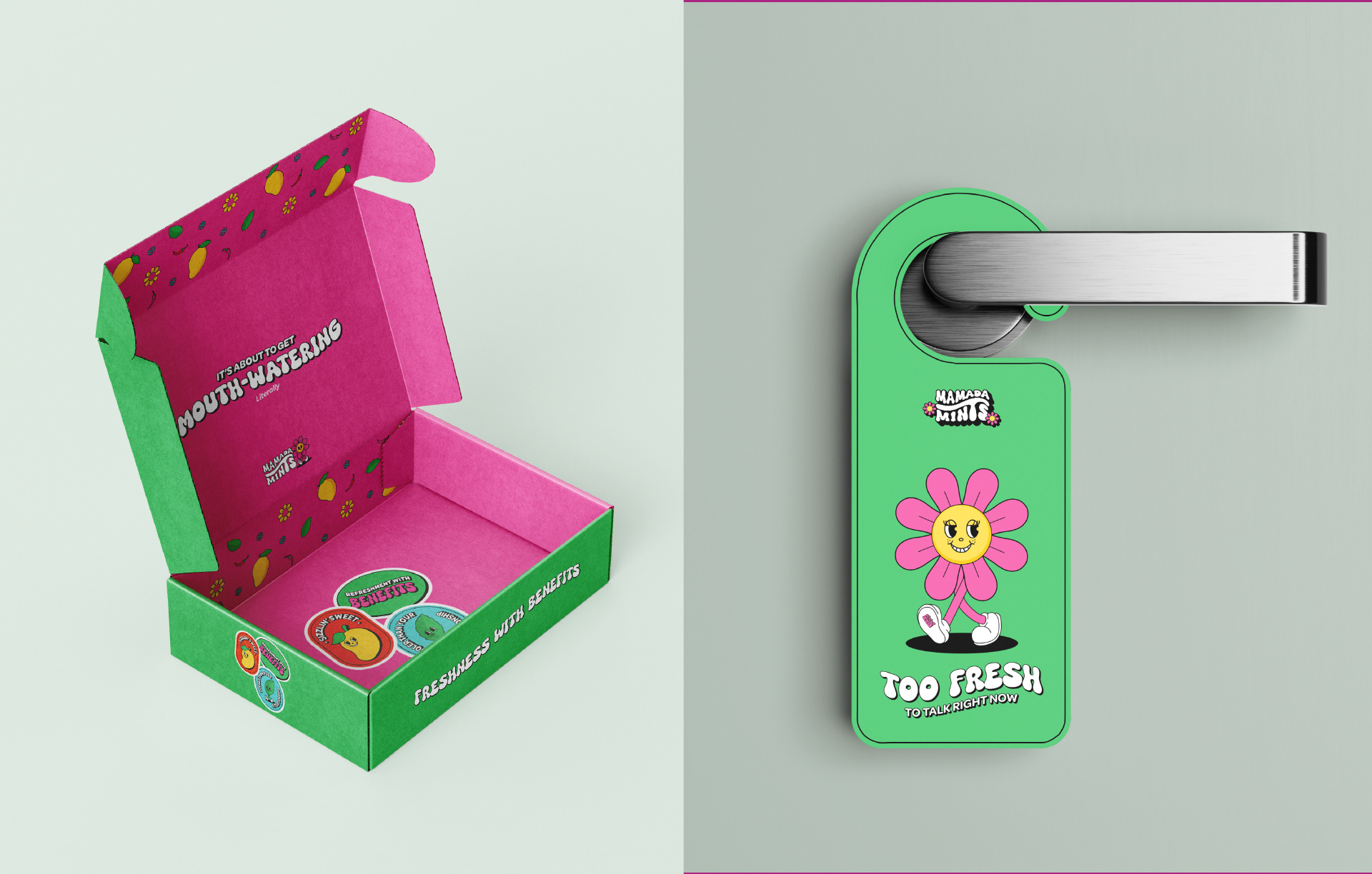
The brand needed to feel instantly eye-catching, fun, and culturally relevant to a Gen Z audience. At the same time, the identity had to remain platform-safe and avoid cliché or overly explicit visuals.
The Solution
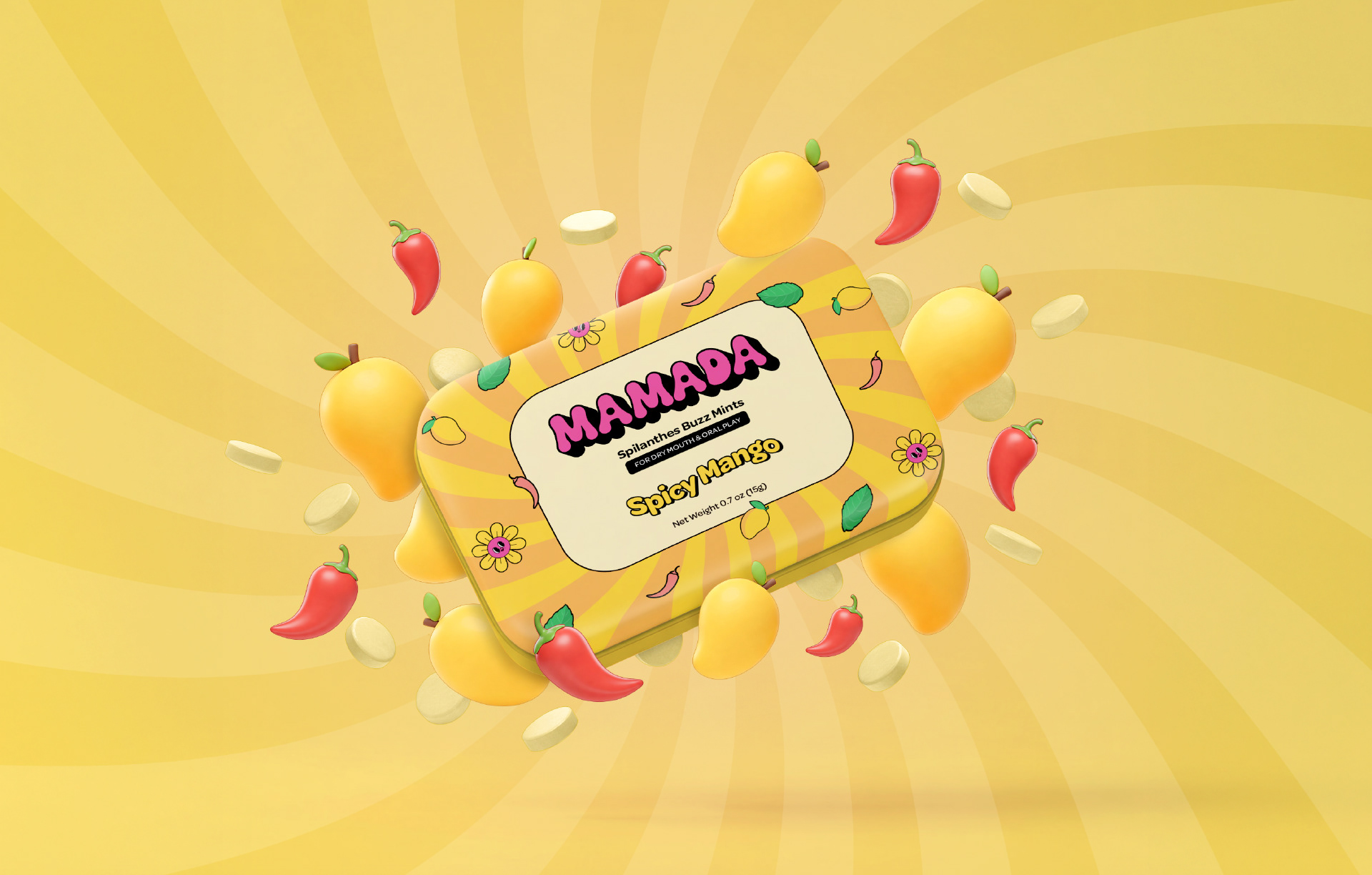
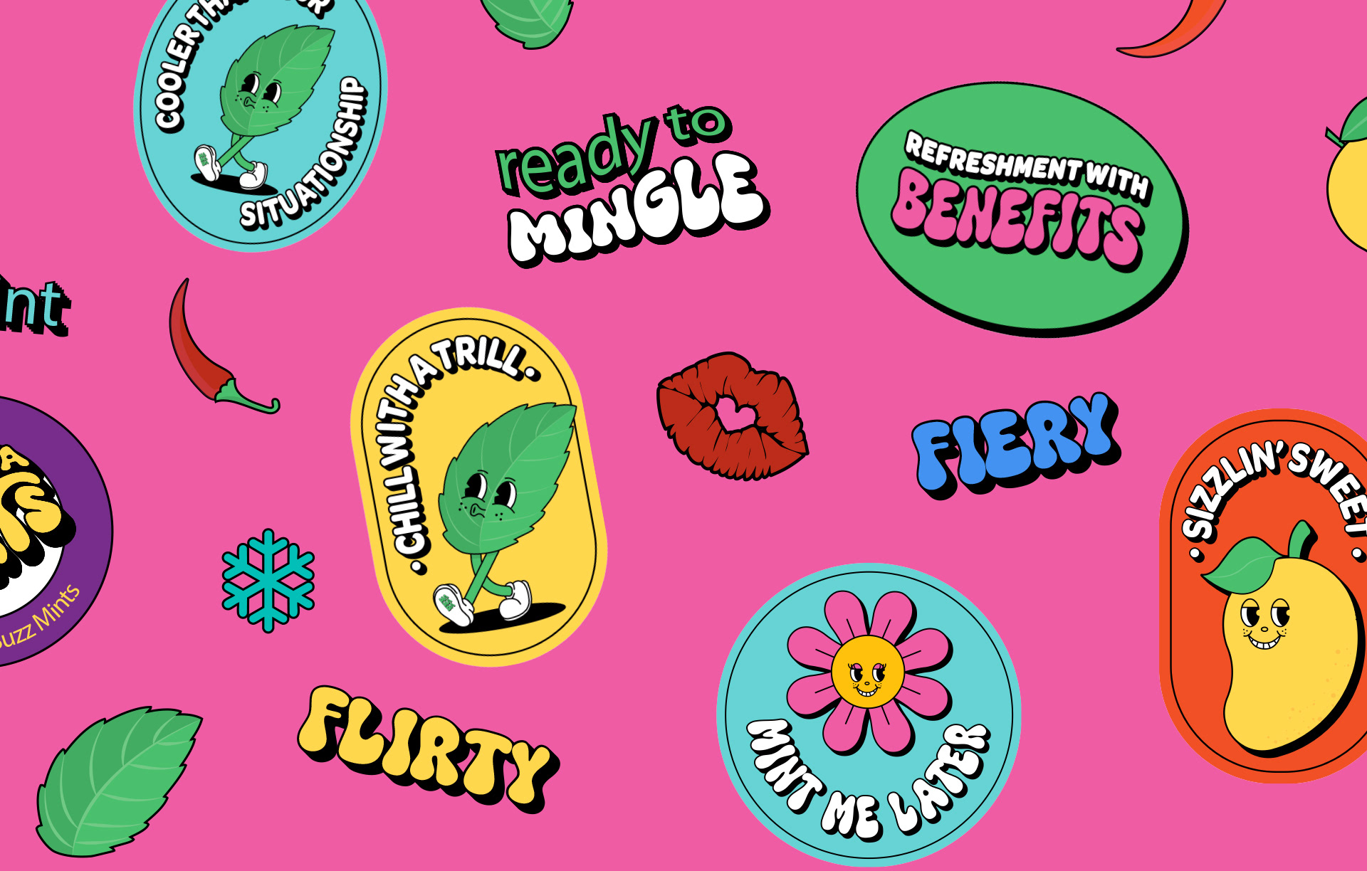
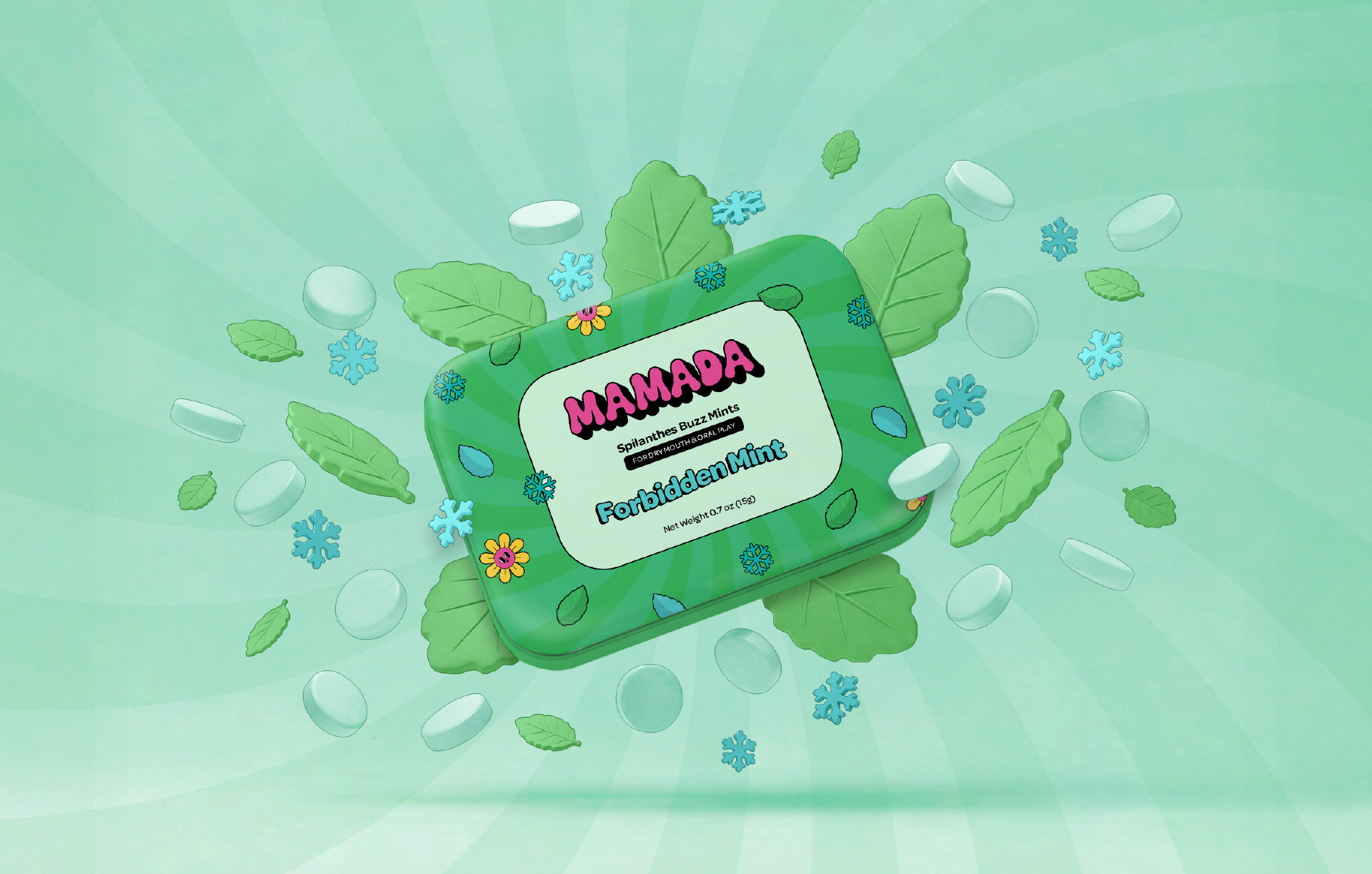
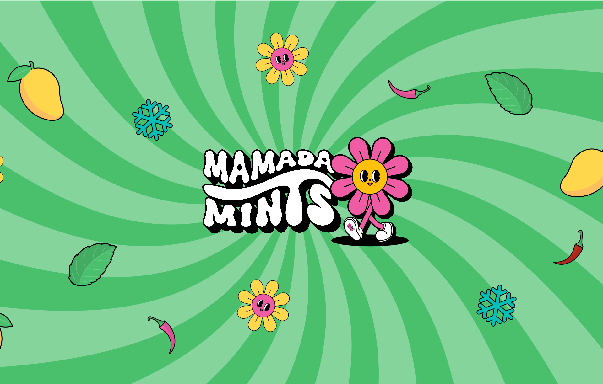
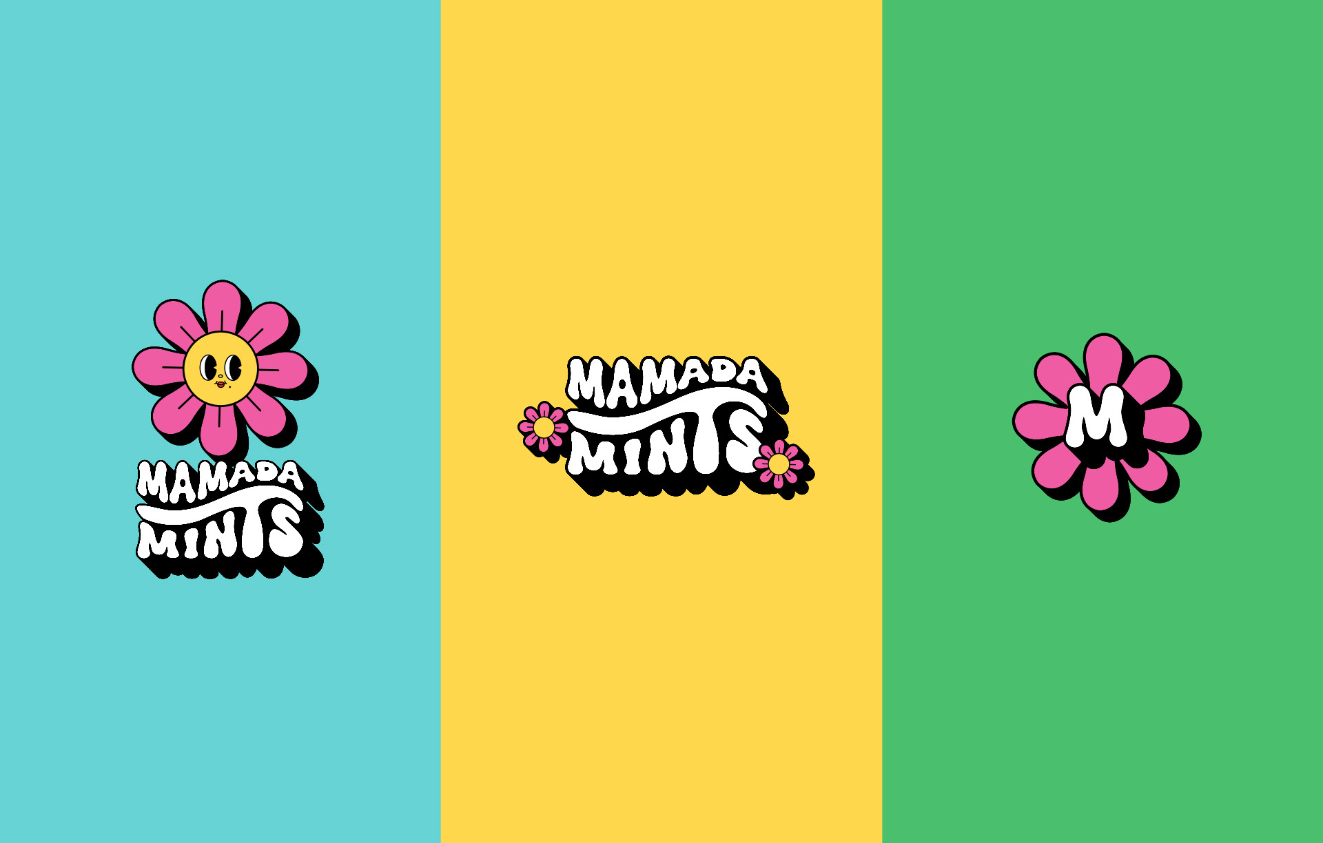
A typography-led logo and a groovy, retro-inspired visual system, drawing on colour psychology and current Gen Z design trends. Using the provided palette as a foundation, I designed custom characters for each flavour and paired them with cheeky, suggestive but tasteful copy.
Design Direction
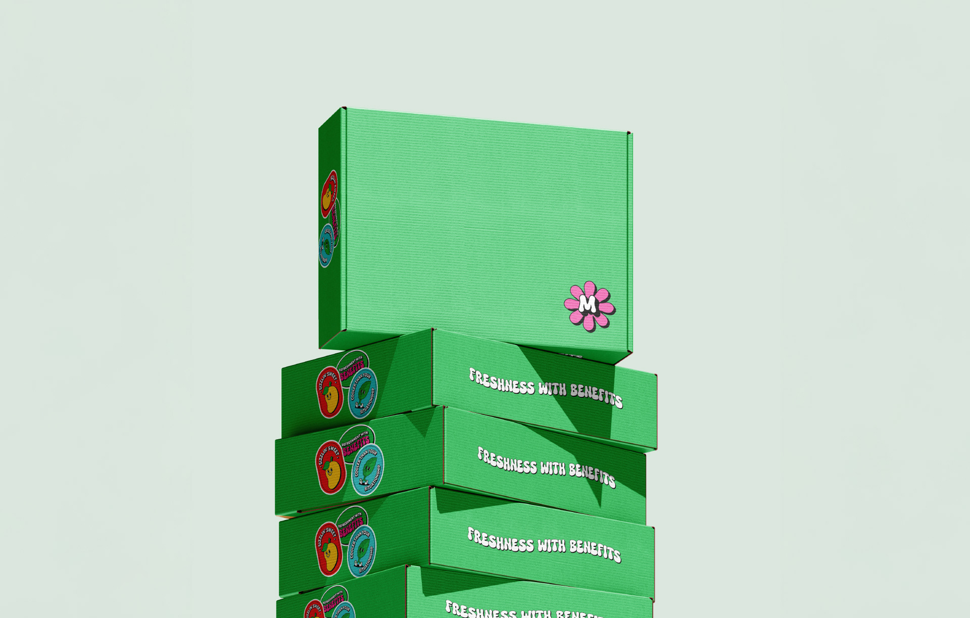
The final identity is bold, playful, and expressive. Retro shapes, vibrant colours, and character-driven visuals create strong shelf and scroll-stopping appeal. The result is a brand that feels fun and flirtatious, yet controlled and intentional, perfectly suited for viral content and impulse purchase moments.